
Learn how to
stay competitive
while marketing your brand and message…
when you don’t have the time, energy, or expertise!
Communicating design is a process of testing, refining, and coding. For example, with a website blog, funnel site, and layout design, each piece is tailored for the specific needs such as pallets, styles, and fonts. However, in general, there’s an array of design elements that are considered standard across the board.
This guide will offer a visual overview and definition of:
A common facet of mobile apps and websites is the hamburger menu. This is named for the icon which commonly denotes its presence, ≡ (three parallel lines), which is thought to look like a hamburger. When clicked, the menu drops down.
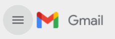
This is an example of a hamburger menu from Gmail.
Clicking on this menu will open an array of options for you to choose from, such as your inbox folders and categories.
To read more about hamburger menus, you can visit the Wikipedia page.
Hamburger menus tend to have a heavy overlap with vertical menus, which may also be called sidebars. This menu style often takes up the entirety of a screen’s vertical space, and is best seen on Amazon, where it is accessed by clicking on a hamburger menu.

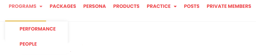
Another common style of navigation menu on desktops is the horizontal menu. As the name implies, this variety spans the horizontal width of the screen. It’s currently one of the most popular styles, as it saves space and is compact.
We at Engage 2 Engage use horizontal menu tabs. As you can see, each page or section is organized horizontally across the page. This gives desktop users a great navigational tool with easy access to a majority of the site.

Depending on the website, this may be the full extent of a horizontal menu. However, in other instances, a site may have a hover-style or drop-down menu attached to their header. This is also referred to as a “sub-menu” tab. In this style of website, hovering over or clicking on one of the tabs will not only highlight the desired selection, but also provide a larger menu with additional options.
Engage 2 Engage also utilizes this design element. Depending on how your website is set up, users will either have to hover over the section or click on it to expand the pages it contains. (On Engage 2 Engage, users hover over the option.) This style of menu is also popular with desktop designs. However, it doesn’t work as effectively when viewed on a tablet or mobile device unless the theme design elements are mobile responsive.
First and foremost, there is no hard and fast rule for thumbnail sizes. What size you want your thumbnail to be is entirely dependent upon what your website looks like. Many websites today use a standardized “grid” layout. Other websites have a “dynamic” layout, where sections will stretch to fit a certain amount of text alongside the image.
For simplicity’s sake, some sites opt to have a standard size for their images. For example, they might stick to square or mostly square images that fit nicely on their site’s grid. Others prefer to automatically downsize and crop images to a 2:1 ratio or a square frame. Choosing how to approach the issue is important and will depend on many factors. If you’re operating a blog or retail website, it’s probably best to stick to a standard image size. If you’re operating something more complex and visual, a dynamic layout may be better.
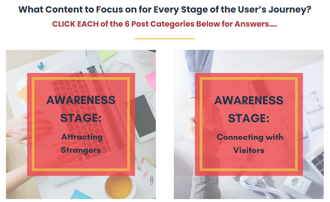
At Engage 2 Engage, our thumbnail images serve as navigational tools. Each thumbnail is an eye-catching visual representation of a different post topic. When you use your thumbnails in this manner, it’s important to include alt codes on your website! This allows users with visual impairments to understand what the image’s purpose is and know where to click.
First impressions are everything, and your banners are intended to grab attention.
For homepage banners it is the first thing that visitors will see when they visit your website. You want that image and text to be eye-catching and purposeful; otherwise, visitors may easily leave in search of a website whose first image is easier on the eyes.
For banners used in your blogs, you will want a clear call to action. Specifically, when someone visits your website, what exactly do you want them to do?
Take, for example, one of Engage 2 Engage’s banners used in a blog post:
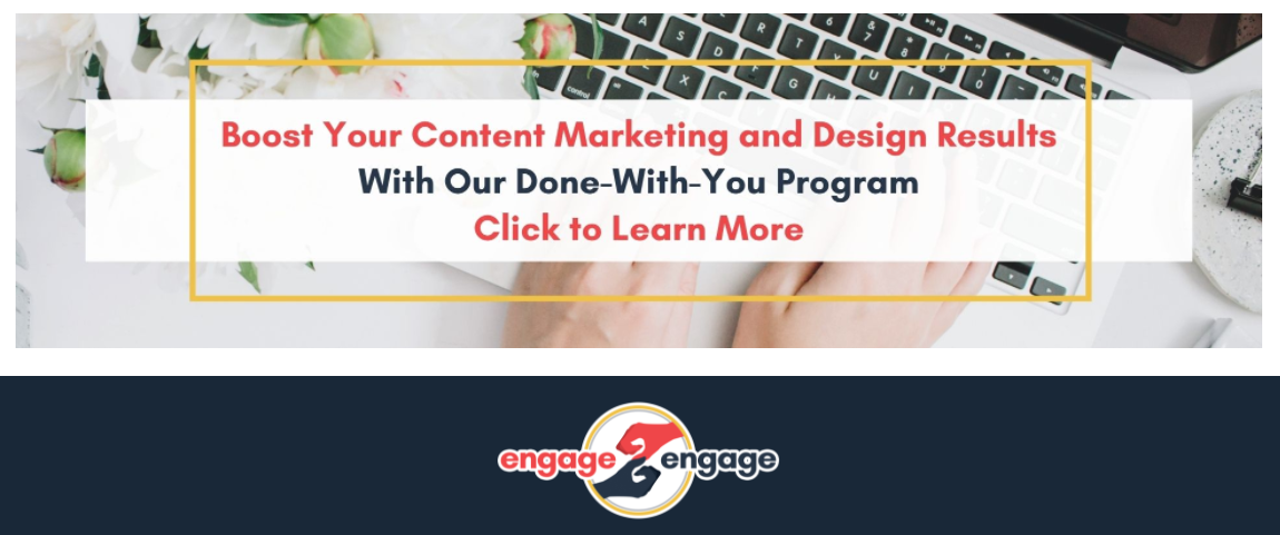
This is a simple design that catches a viewer’s attention with an image. The accompanying text helps to elaborate upon the purpose of the site and a call to action.
Not only is this design clean and clear. It also commands visitors with a certain simplicity by emphasizing a single strong verb: Click. From there, it explains what visitors can expect to learn from engaging. In this example that would be content marketing and design. Navigation is also plainly labeled and without much fanfare. In sum, this banner gets right to business.
Banners do not necessarily have to contain text to be effective, though. Some websites opt to show only images; other websites opt for only textual banners. Which option you choose depends on your intended audience and your goals.
For image-based banners, it’s essential that you also implement accessibility coding. Include “alt text” to describe your image; this is especially important when your header includes essential information, such as contact details.
But a banner should also be more than eye-catching. It should also illustrate what a company does and convey who they are. Keep in mind that you aren’t just trying to sell something but that you are also trying to capture an audience and get them to perform a specific action. As such, a good banner allows you to portray who you are with as few words as possible and well-chosen visuals that are appealing to your brand.
Website icons are often small, simple visual representations of the concept contained within a page or option. They are commonly used as indicators for input or submission fields, although they can also be used to draw attention to certain passages of text.
They’re somewhat similar to emojis; they communicate complex ideas quickly and easily. Think, for example, of what comes to mind when you see these emojis:
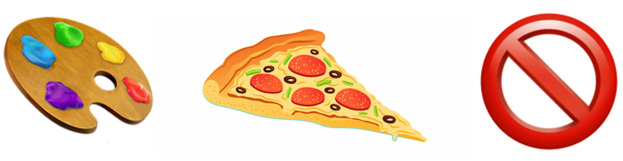
The first one likely makes you think of something artistic or creative; therefore, when a website gives you the option to click on an icon with a similarly vibrant color palette, you likely understand that you can view content related to art, creating, or some similar content.
The second emoji depicts a popular and delicious treat that most associate with good food to be had. As such, a pizza-shaped icon would indicate that the website visitor is about to enjoy some content that gets the mouthwatering.
Finally, the last emoji is one that we all recognize as a universal signal to stop or prohibit from what you are doing. Someone who sees that icon will understand that they should stay where they are and pay close attention to some important detail
Icons are most common on social media platforms where people communicate in short, pithy messages. However, they can be used for so much more. You can also use icons to demonstrate portions of the site or to draw attention to a part of the page. For instance, you can use them to demonstrate different activities as sampled here.

Bottom line, many elements come together to create the perfect site. The design, content, linking, call to actions, and more. Combining all these pieces can be tricky.
That’s why we at Engage 2 Engage are here to help take the workload off your to-do and relieve you from the overwhelm of putting it all together. Our programs are designed to assist you in designing your site, even if you don’t know where to start.

while marketing your brand and message…
when you don’t have the time, energy, or expertise!